

Sateni
At the core of the project was a commitment to encapsulate Sateni’s commitment to purity and nature. Understanding that customers are drawn to authenticity, XP Design crafted a visual language that spoke to the organic and rejuvenating nature of Sateni’s products.
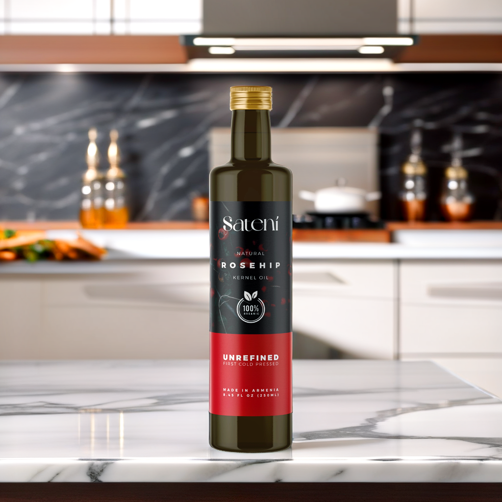
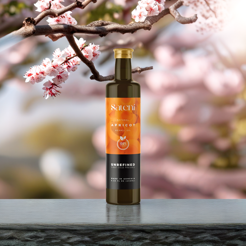
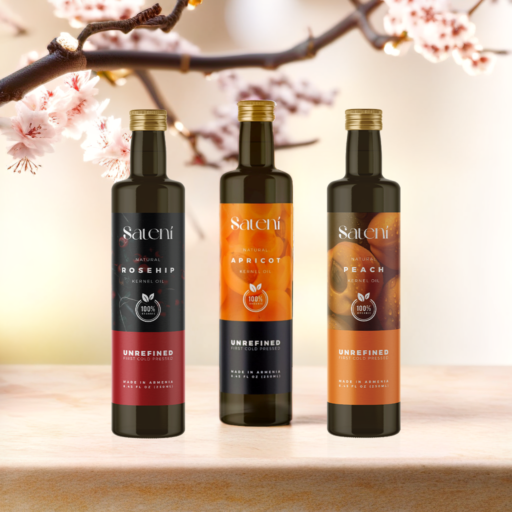
For the bottle design, simplicity was key. A minimalist approach allowed the vibrant natural hues of the oils to shine through, simultaneously ensuring that the sensory experience began even before the product was used. The logo, a graceful and refined representation of the Sateni ethos, was created to reinforce brand recognition and convey a sense of trust and sophistication.
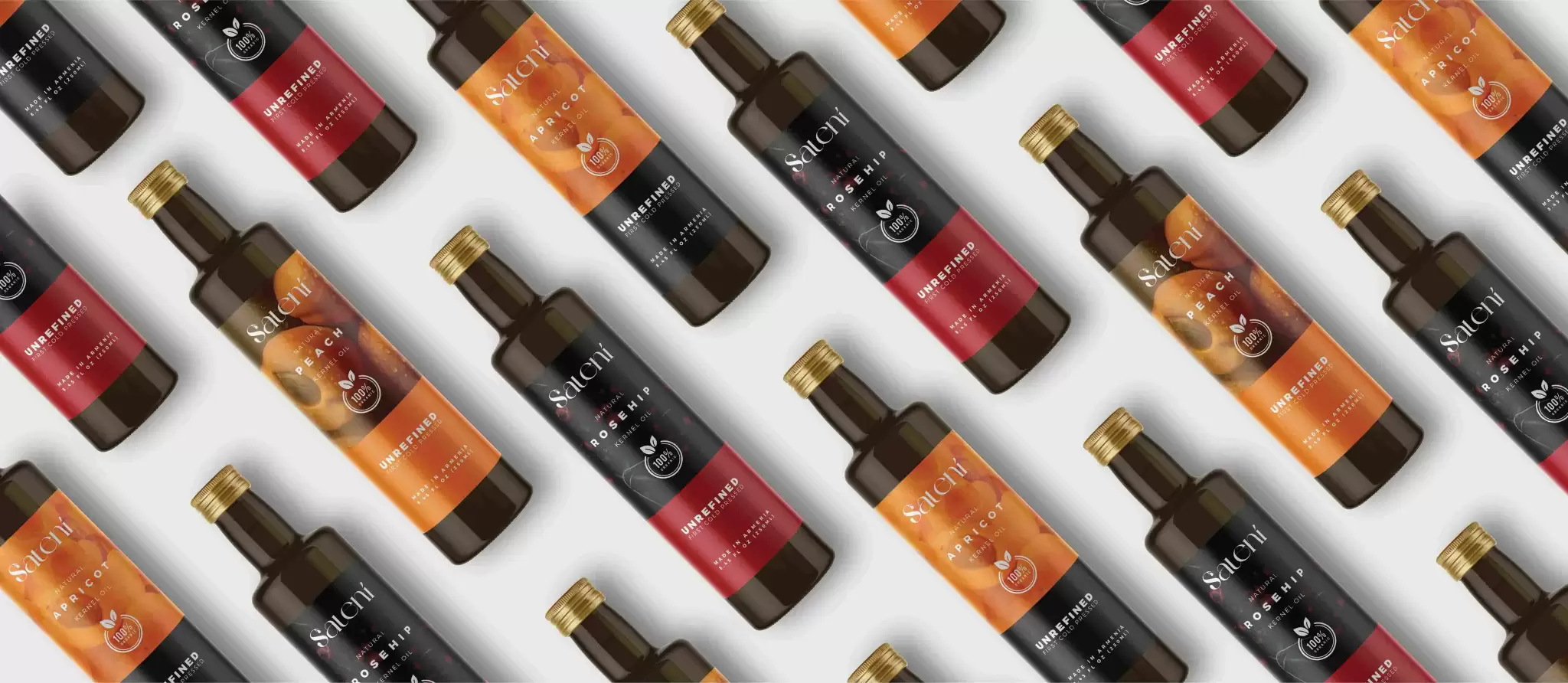
XP Design’s efforts extended beyond the bottles and logos to every touchpoint of the brand—ensuring consistency across all platforms and mediums. With a penchant for creating resonant and enduring brand identities, this project stands as a testament to the ability to marry function and form, yielding a distinct and memorable brand presence that resonates with customers and enhances the overall user experience.
The result of this branding initiative was a cohesive aesthetic that not only increased the shelf appeal of Sateni’s products but also aligned with the company’s vision of bringing the power of nature into daily beauty regimens. It’s the thoughtful touches and attention to detail that have marked this project as a highlight in XP Design’s portfolio, showing potential clients the impactful results of expert branding craft.

